“Art flourishes where there is a sense of adventure”
Essential Questions:
1.What is the difference between watercolor and acrylic painting, and does it effect how I approach a painting?
2. How do we create the luminosity effect?
Enduring Understanding:
~Draw what you see, NOT what you think you see~
Learning Objectives:
Students will-
1. Recognize and produce various watercolor techniques
2. Learn and practice the art of watercolor
3. Understand “reverse painting”
4. Enhance their compositional skills
Terms:
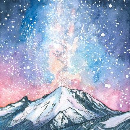
Luminosity: (in ref. to watercolor) light passes through to the white paper and reflects back through the colors with a translucent quality.
Value: lightness/darkness of an area
Composition: organization of different parts to create a unified whole
- what needs to be emphasized?
- 1 object focal point (NOT IN MIDDLE)
- strong contrast (light against dark-cool against warm)
- eyes need a place to rest!
- visual pathways to the focal point
Tone: how light or dark a color is
*tonal values = more important than color itself!
Tips from the Teach:
• PATIENCE-PERSERVEARANCE-PRACTICE
· less is more
· water = white
· watercolor = a semitransparent medium, light colors cannot be laid over dark---lay down light colors first!
· Always have clean water (filtered is most effective)
· PLAN where the light is
· Pencil sketch accurately
· Free flow
· Consider what mood you’d like to convey and try to show that through brushstrokes
Washes:
· quick, well loaded brush
· relaxed wrist
· once wash is applied-leave it
· CONFIDENCE is KEY!
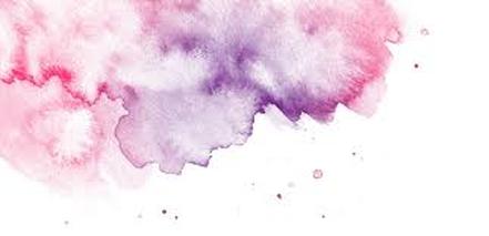
--wet on wet--
- beautiful, atmospheric effects (skies, water, gradiating tone)
-“living dangerously”
- mix colors on paper
- colors spread and merge together
- dries soft and hazy
- can only control to certain extent…let happy accidents happen!
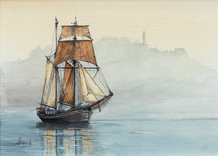
--wet on dry--
- “direct”
- sharp, well defined edges
- doesn’t spread
- can do washes, let dry, then paint over
- lots of white can be left
- FUN FACT!!---painting over underlying color is more luminescent (painting blue over a dry yellow- vs. mixing blue and yellow in palette). Why do you think this happens?
--graduated wash--
- strong color at top gradually lightening toward bottom
“OH NO!!! I messed up!”………fix this by:
- lifting with brush and water
- q tip-cotton ball
- scratch off
- add hi-lights with white paint (not recommended)
Effects and Tricks:
- scumbling: dry brush application
- salt
- flick
- stain (rinse off)
- saran wrap, bubble wrap
Constraints:
- watercolor
- brushes
- cold-pressed (heavy weight) paper
- image reference
- masking fluid
Must Haves: (a.k.a: what you will be graded on )
- pencil pre-drawing (Accuracy is key)
- solid composition
- masking tape border
- strong contrast
- white paper remaining
- mix of hard and soft edges (how do we do that? Reference washes)
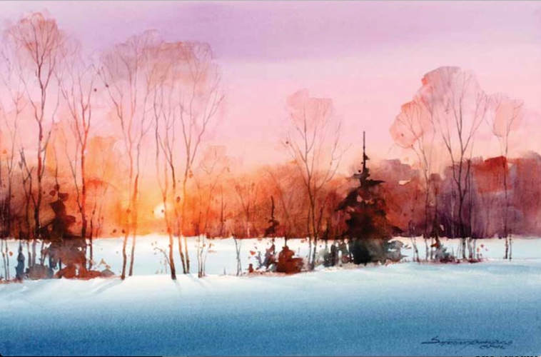
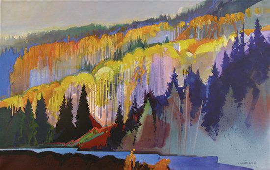
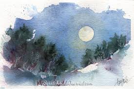
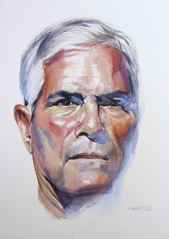
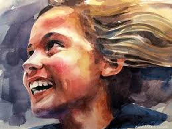
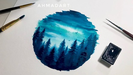
discussing examples below : I DO encourage to incorporate your individual style...along with painting FROM OBSERVATION. See tree landscape below.
|
|
|
|